

A developer should always be able to present the final outcome in an attractive manner because what the end-user is going to feel first is the look and feel of the application. In that case, you need CSS to create an attractive interface that helps you with the first impression of the end-user. In this article, I’m going to explain some of the CSS tricks and tips.
Where to put Styles
As a frontend developer, you must be concerned about the size of the code because whenever you’re able to create a smaller application, it will load faster. It’s a known fact that the end-users don’t like slower applications. When you’re developing the frontend as modules, you can create a stylesheet for each module. But my suggestion is that you should not use such module wise stylesheet but rather use a common stylesheet. It’s always better to handle styles commonly.
Handling stylesheets commonly has two sides. On one side, it’s going to be a smaller one because common styles are not repeated everywhere. On the other side, it’s easy to make a systemwide change because you don’t have to change each and every stylesheet when you have only one.
Common Style Handling
There’re a few things that you should know when handling a common stylesheet.
1. Variable Style Handling
When you’re building a UI, most common values such as colors, padding, etc. can be stored as variables in the stylesheet.
:root{

--primary-color: #3f51b5;

--secondary-color: #009688;

--text-color: #fff;

--text-hover-color: #000;

--default-padding: 15px;

}
Here :root is the root element of the document which is <html></html> in an HTML page. You can use both :root and body selectors to select the global scope.
The variable name must begin with two dashes (--) and it’s case sensitive. You can use the variable using var(variable, fallback_value)function. The fallback value here is an optional one which used to give a default value to appear when the variable property is invalid.
.btn-primary{

background-color: var(--primary-color);

color: var(--text-color);

}

.container{

padding: var(--default-padding);

}
The beauty of this method is that if you need to change the theme of the web application, you don’t have to change each and every style but simply change the variables.
2. Styling with a Hierarchy
As mentioned before when creating a stylesheet, it should be as small as possible because it will affect the speed of the web application. So you will have to consider avoiding style repeats.
Let me take a code segment example,
<body>

<div class="container">Test Code</div>

</body>
with the below example styles:
.container{

padding: 15px;

width: 80%;

height: 100%;

background-color: #ccc;

color: #000;

margin: 0 auto;

text-align: center;

}

.container:hover{

padding: 15px;

width: 80%;

height: 100%;

background-color: #000;

color: #fff;

margin: 0 auto;

text-align: center;

}
For this code, you will get a result as follows

Hierarchical Styling Example

Hierarchical Styling Example Hover
Now if you inspect the styles in hover mode, you can see that the hover styles have overwritten the existing styles.
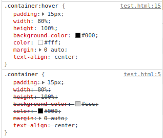
Inspect styles
Here I have changed only two styles in the hover, but I have repeated all the other styles. That will not be required since the browser is going to apply the first style and then overwrite it from the next one. You only need to use changed styles in an event like this.
My point here is that you should maintain a proper hierarchy when applying styles to avoid style repeats. So my suggestion is to keep all the common styles at the top level and then use the styles that are needed to be changed only in the next levels such as hover, active, media queries, etc.
3. Usage of Media Queries
Responsiveness in a web application is somewhat a requirement these days. So when you’re putting media queries in a common stylesheet, my suggestion is not to put media queries everywhere but at the bottom of the stylesheet. So when the screen size has been changed, your media query will overwrite the default style set.
One more thing you should know here is that the styles are applied from the top of the stylesheet to the bottom. There’re exceptions when you’re going to use different CSS selectors, but basically, they’re working like that.
Here’s an example set of media queries that I’m using,
/*

* Default Styles

*/
/*

* Device = Laptops, Desktops (Full HD)

* Screen = 1367px or higher resolution desktops

*/

@media (min-width: 1367px) { }
/*

* Device = Laptops, Desktops (HD)

* Screen = 1281px or higher resolution desktops

*/

@media (min-width: 1281px) and (max-width: 1366px) { }
/*

* Device = Laptops, Desktops

* Screen = 1025px to 1280px

*/

@media (min-width: 1025px) and (max-width: 1280px) { }
/*

* Device = iPad Pro (Portrait)

* Screen = 1024px to 1366px

*/

@media (min-width: 1025px) and (max-height: 1366px) and (orientation: portrait) { }
/*

* Device = Tablets, iPads (Portrait)

* Screen = 768px to 1024px

*/

@media (min-width: 768px) and (max-width: 1024px) and (orientation: portrait) {

@media (min-width: 991px) { }

@media (max-width: 990px) { }

}
/*

* Device = Tablets, iPads (Landscape)

* Screen = 768px to 1024px

*/

@media (min-width: 768px) and (max-width: 1024px) and (orientation: landscape) {

@media (min-width: 991px) { }

@media (max-width: 990px) { }

}
/*

* Device = Low Resolution Tablets, Mobiles (Landscape)

* Screen = 481px to 767px

*/

@media (min-width: 481px) and (max-width: 767px) { }
/*

* Device = Most of the Smartphones Mobiles (Portrait)

* Screen = 320px to 479px

*/

@media (min-width: 320px) and (max-width: 480px) { }
Tips you might require in CSS
1.Relative Sizing
You should try to use relative units such as em, rem, vh, vw, %, etc as much as possible than using absolute units such as px when you’re adding sizes. Because when you’re creating a responsive UI, these relative units are more useful because they will change according to the current environment.
2. :not selector
You can use the:not() selector in many scenarios. Here I’m going to explain one of the usages that I haven’t seen much.
Let’s take an example,
<div class="item special"></div>

<div class="item"></div>

<div class="item"></div>
Now think that you have to apply a style only to the first div, what you need to do is apply style as follows.
.item.special{ }
Now think that you have to apply a style to all the items except the first div, then you need to use the :not operator as follows.
.item:not(.special){ }
And if the DIVs are placed as follows,
<div class="special">

<div class="item"></div>

<div class="item"></div>

</div>
If you need to apply a style to the items which are not within the “special” div class, you can use the:notoperator as follows,
:not(.special) > .item{ }
Debugging Styles
This topic is very important when you’re developing a UI. Inspect Element option in a browser is an important tool when debugging and creating styles.
When you’re inspecting a webpage, you will get an interface similar to this.
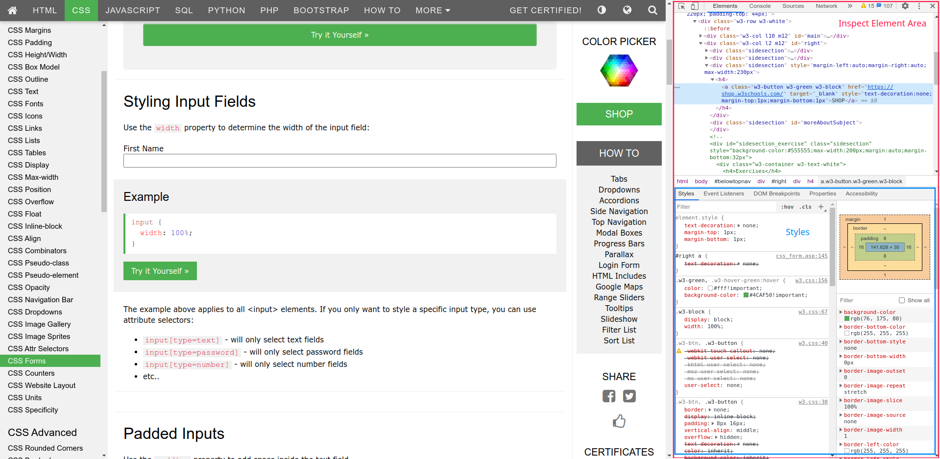
Inspect Element Area
In the area of the styles, you can find each and every style which are currently applied to the selected component as well as the file name and the line number of the style. These will come in handy when you’re debugging the styles.
Also, you can toggle between events such as hover, active, etc. using :hov in the inspect element area.
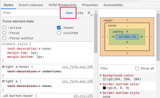
Inspect Hover Event
When you’re creating a UI, things might not be displayed as you expect. Let take an example.
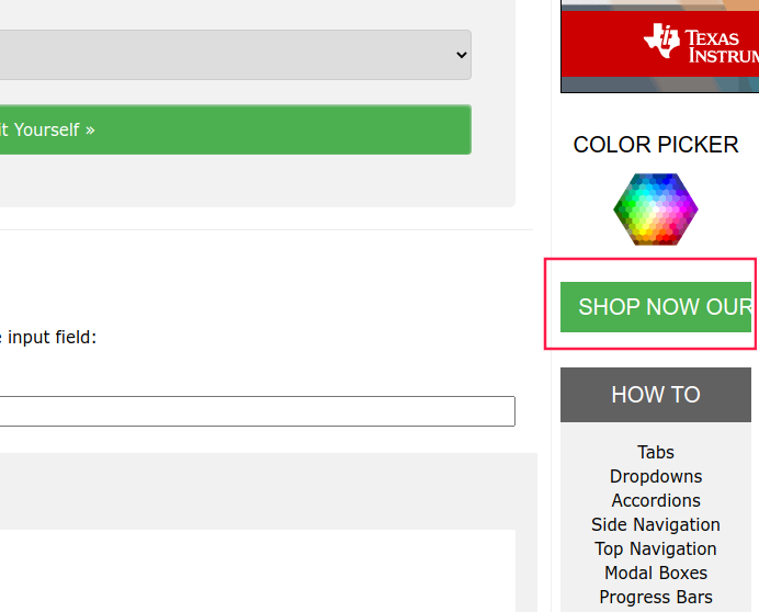
Inspect Element Example
In this example, you have a button with a long text. So part of the text is not displayed.
In a situation like this, you can try adding or changing styles in the inspect element section so you know what style changes you should make to correct the issue.
I’m going to add a new style here to fix it. Once you type the first letter, you will get a set of suggestions and you can try any of them.
Style Suggestions
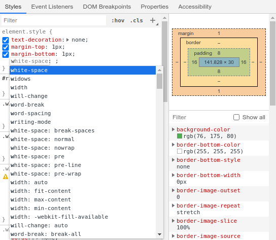
I’m going to try white-space style here. Once you select the style, you will get a set of suggestions for values. Try changing these values and you will get a live preview of what happens.
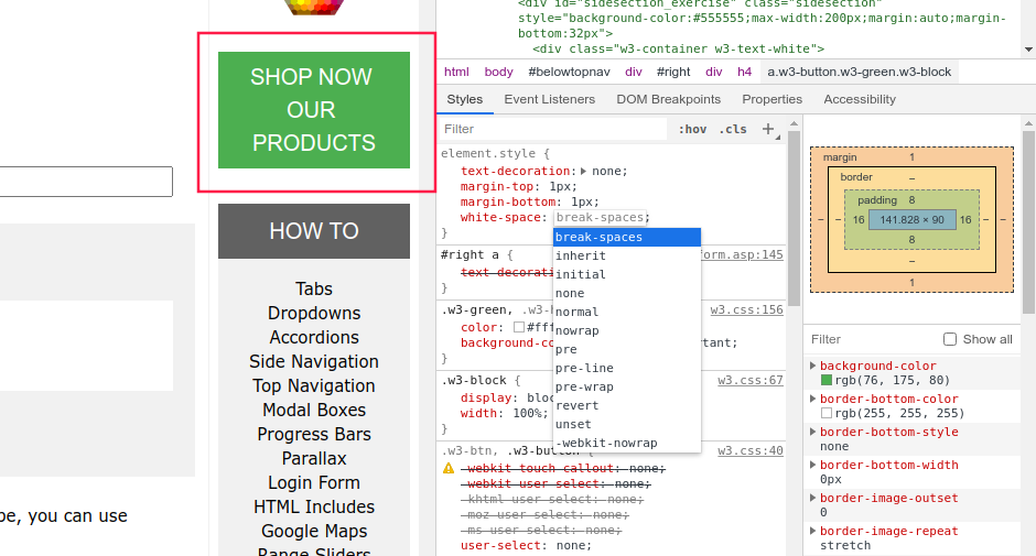
Live Preview of Styles
Once you find the required styles, you can copy it and put it in the stylesheet. In this way, you will be able to simply resolve most of your style problems.
Targetting Browsers
Sometimes your UI might have different UI problems in different browsers. In this situation, the first thing that you should be looking at is that you have the latest update of the browser. It’s not recommended to use older versions because they might have security issues and other problems.
If you have the latest browser version and are still experiencing the same issue, then you have to introduce browser targetted styles to your stylesheet. Here I have included some browser targetted styles that I’m using.
/* Safari Only */

@media not all and (min-resolution:.001dpcm){

@supports (-webkit-appearance:none) { }

}
/* Firefox only */

@-moz-document url-prefix() { }
Including SVG Icons
1. Include directly in the stylesheet
You can directly include an SVG icon in a stylesheet as a background image of ::before or ::after selector as follows.
.icon::before{

content: "";

display: inline-block;

background-image: url("data:image/svg+xml;charset=utf8,<svg></svg>");

background-repeat: no-repeat;

background-position: center center;

background-size: cover;

width: 20px;

height: 20px;

}
Here, you must change # marks in the URL with %23, or else it won’t be working as expected.
2. Include as a font
You can use a font generating tool such as https://icomoon.io/ to create a font with your SVG files and you can directly import your font files to the CSS as follows.
@font-face {

font-family: 'icons';

src:  url('fonts/icons.eot?q5frtn');

src:  url('fonts/icons.eot?q5frtn#iefix') format('embedded-opentype'), url('fonts/icons.ttf?q5frtn') format('truetype'), url('fonts/icons.woff?q5frtn') format('woff'), url('fonts/icons.svg?q5frtn#icons') format('svg');

font-weight: normal;

font-style: normal;

font-display: block;

}
Now you can use your SVG icons anywhere easily as a normal font. There’re other ways to include SVG icons as well but I find these two methods are easy to use.
References: https://www.w3schools.com/
I think I have added something to your knowledge in this post and please comment if you have any clarifications or suggestions regarding my post.